Portfolio

Work that speaks for itself and delivers results through impact.

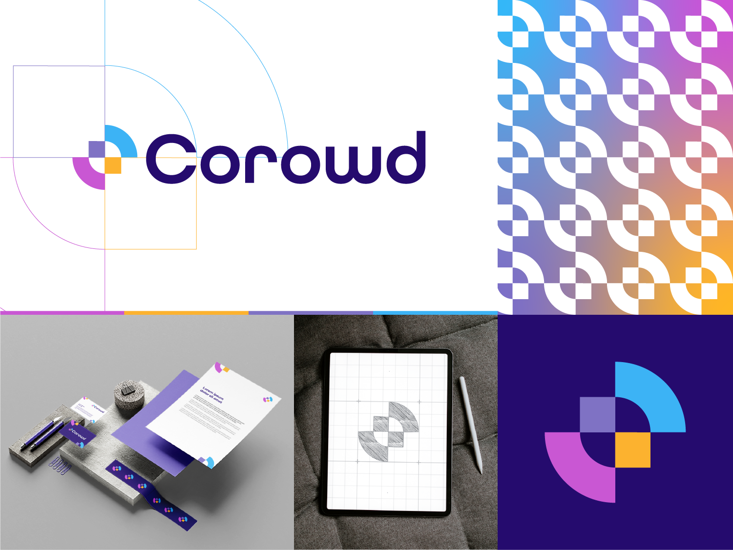
Corowd brand identity and logo design by Wishaq Akbar

April 25, 2026

Corowd is a SaaS platform built around one core problem — managing crowds of users, requests, or interactions in a structured way without chaos taking over the system.

When designing the brand, I moved away from typical “enterprise SaaS polish” and instead focused on controlled density — the feeling of many moving parts working in sync. The identity explores the balance between order and flow, using tight spacing, rhythmic structure, and a visual language that subtly suggests movement without noise.
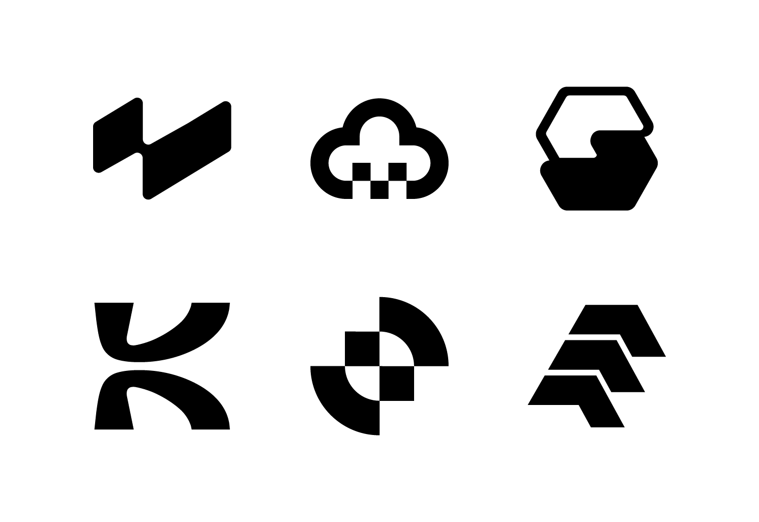
Logofolio v1 — collection of logo designs by Wishaq Akbar

February 2, 2026

Logofolio v1 is a curated collection of logo designs created across various industries including SaaS, logistics, creative agencies, tech startups, and modern businesses. This collection highlights my approach to strategic logo design — combining simplicity, scalability, and strong visual concepts.

Each logo in this series was crafted with a focus on brand positioning, clean typography, balanced composition, and timeless aesthetics. The goal was to create distinctive marks that remain memorable while maintaining versatility across digital and print applications.

CherryPeople Logo 01 scaled

April 9, 2025

Cherry People is a specialized SaaS GTM recruitment firm serving vendors across the APAC region. The brand needed to reflect precision in hiring while maintaining a human-first, relationship-driven tone.

Instead of going corporate and rigid, I leaned into the idea of “cherry-picking” top talent — selective, intentional, and quality-focused. The identity balances professionalism with subtle warmth, reinforcing both expertise and approachability. Clean typography, confident spacing, and a refined color direction help position the company as focused and premium without feeling cold.

zeltask SaaS brand identity and logo design

December 25, 2024

For Zeltask, a continuous improvement operations platform built for frontline teams, I developed a complete brand identity that reflects structure, efficiency, and operational excellence. The platform connects maintenance, quality, and safety within a single unified system, so the branding needed to communicate clarity, reliability, and modern industrial innovation.

The project included logo design, brand strategy, typography system, color palette development, and a scalable visual identity suitable for SaaS dashboards and enterprise communication. The visual direction was built around precision, workflow alignment, and connected systems — reinforcing Zeltask’s mission of streamlining operational performance.

Amplia Logo Main Presentation scaled

November 6, 2024

I developed a complete brand identity For Amplia, the MLS platform of Puerto Rico, built around connectivity, authority, and simplicity. The platform enables real estate professionals to distribute property listings to the most important real estate platforms from one centralized system, so the branding needed to communicate efficiency and industry leadership.

I created the full identity system including logo design, typography, color strategy, and a structured visual language tailored for real estate professionals. The direction focuses on clarity, trust, and digital integration — reflecting the platform’s role as a central hub for property distribution.

0xTax Logo Main Presentation

August 30, 2024

For 0xTax, a modern tax services brand, I created a complete brand identity focused on clarity, trust, and professionalism. The service helps individuals and businesses manage their tax preparation and filing in a simple and reliable way, making a typically complex process more accessible and organized.

The branding was designed to feel clean, structured, and highly legible — reflecting accuracy and financial responsibility. I developed the full identity system including logo design, typography, color palette, and a consistent visual direction that works across both digital and print applications.

AnotherLift Logo Main Main Presentation

March 27, 2024

An SEO agency, focused on driving measurable digital growth, I developed a complete brand identity for AnotherLift, centered around momentum, performance, and strategic elevation. The name itself suggests growth and uplift, so the branding needed to visually communicate progress and upward movement.

I created the full identity system including logo design, typography pairing, color palette development, and a bold yet clean visual direction suitable for digital marketing environments. The design approach emphasizes clarity, confidence, and results-driven strategy — reflecting the agency’s mission to lift brands higher in search rankings and online visibility.

algorri Logo Main Presentation

March 22, 2024

A medtech care platform, I created a complete brand identity designed to balance innovation with human-centered care. The platform focuses on delivering smarter healthcare solutions through technology, so the branding needed to feel both advanced and approachable.

I developed the full visual system including logo design, brand strategy, typography, color palette, and a clean UI-focused design direction. The identity emphasizes precision, trust, and medical reliability while maintaining a modern tech-forward presence. Soft yet confident colors were selected to reflect care and reassurance, supported by structured layouts that communicate clarity and efficiency.

Clickguides Logo 01

March 21, 2024

ClickGuides is a Chrome extension designed to record user clicks and turn them into simple, reusable step-by-step guides. The goal of the product is to make onboarding, documentation, and workflow explanation effortless for teams that rely on repetitive browser-based tasks.

For this project, I created a complete brand identity that feels lightweight, intuitive, and product-first. Instead of overcomplicating the visual language, I focused on clarity and instant understanding — because the product itself is about simplicity. The logo and system were designed around the idea of guided interaction and smooth digital flow, supported by a minimal and highly readable design approach.

Ecopeak Logo Main Presentation

March 15, 2024

Ecopeak operates at the intersection of sustainability and performance — delivering solar energy solutions designed for long-term impact.

For this brand, I avoided the typical “green energy” clichés. Instead of obvious leaf icons and predictable gradients, I focused on elevation and clarity. The identity reflects upward movement — peak performance — while maintaining a grounded, environmentally conscious feel.

DefiSpace Logo Main Presentation

March 15, 2024

It is a space where decentralized finance operates without borders. Instead of approaching it like a traditional fintech brand, I treated it like an ecosystem.

The identity leans into contrast and depth. The logo mark was designed to feel expansive, almost orbital — suggesting movement, liquidity, and an open financial frontier. Rather than cluttering it with typical DeFi symbolism, the visual language focuses on space, tension, and controlled energy.

7th Grid Logo Main Presentation

March 10, 2024

For 7th Grid, a SaaS-based technology platform, I developed a complete brand identity designed to reflect innovation, structure, and scalability. The objective was to create a modern, tech-forward brand that communicates precision and digital intelligence.

The project included logo design, brand strategy, color system development, typography pairing, visual hierarchy, and a scalable design system suitable for web and product interfaces. The identity was built around the concept of “grids” — symbolizing structure, systems, and seamless integration — while maintaining a clean and minimal SaaS aesthetic.

AsetPedia Logo R2 Main Presentation

March 10, 2024

I developed a complete brand identity designed for AsetPedia, a financial asset management firm, to reflect stability, intelligence, and long-term financial growth. The brand needed to communicate trust and expertise while maintaining a modern and structured presence in the finance sector.

BrandAlly Logo Main Presentation

March 2, 2024

BrandAlly isn’t just a service provider — it’s a strategic partner. The concept behind the name immediately suggested trust, collaboration, and long-term alignment, so the identity had to feel supportive yet authoritative.

Rather than designing something loud or trend-based, I built a system that feels composed and intentional. The typography is confident without being aggressive. The color direction balances professionalism with warmth. Every element was structured to communicate guidance, partnership, and brand clarity.

CROPILOT Logo Main Presentation

January 11, 2024

Cropilot is an AI-powered SaaS platform built to guide decisions with intelligence and precision. The concept behind the name — “co-pilot” — inspired the entire direction of the brand: technology that doesn’t replace you, but assists you.

For this project, I designed an identity that feels adaptive and forward-moving. The logo system reflects motion and guidance, while the visual language emphasizes clarity over complexity — because AI should feel empowering, not intimidating. Subtle gradients and directional elements were introduced to suggest progress, automation, and intelligent support.

NileLink Logo Main Presentation

November 18, 2023

I developed a complete brand identity for a modern logistics and delivery coordination service. The brand focuses on connecting businesses with fast, reliable, and organized transport solutions, ensuring smooth movement of goods from pickup to final delivery.

The identity was designed to communicate clarity, movement, and dependability. I created the full branding system including logo design, typography selection, color palette, and a cohesive visual direction that supports both digital platforms and operational use cases. The visual language is structured and minimal, reflecting efficiency and real-world reliability in logistics operations.

Chemistry2O brand identity and packaging design

October 1, 2023

Chemistry2O is an educational initiative designed to make chemistry more accessible, engaging, and less intimidating for students. The idea behind the brand was to break away from the traditional “boring textbook” aesthetic and create something that feels energetic and modern.

Instead of leaning into overly complex scientific visuals, I focused on clarity and curiosity. The identity plays with balance — structured enough to reflect academic credibility, but dynamic enough to spark interest. The typography feels clean and intelligent, while the visual elements subtly reference molecular connections without overwhelming the design.

Drywaller Marketer logo and brand identity design

August 31, 2023

Drywaller Marketer is built for a very specific audience — drywall contractors who want more leads, more visibility, and real business growth. The brand isn’t polished for Silicon Valley. It’s built for the trades.

For this identity, I leaned into strength and clarity. Bold typography, solid structure, and a no-nonsense visual tone reflect the industry it serves. The branding avoids flashy marketing clichés and instead focuses on confidence and results — just like the contractors it represents.

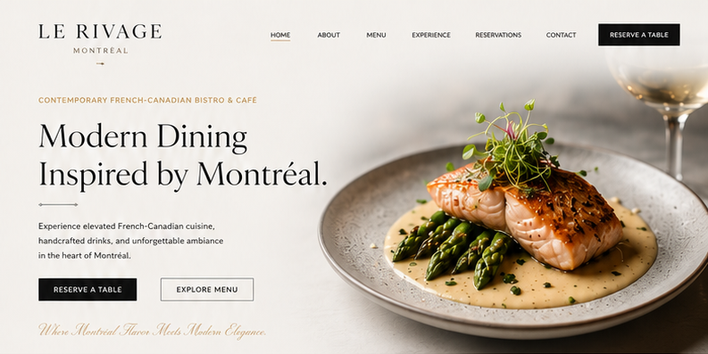
web page hero

May 28, 2026

I designed and developed the Le Rivage Montréal website in Elementor, focusing on a clean and modern luxury dining experience inspired by premium French-Canadian bistros. The project combines elegant typography, refined layouts, immersive food photography, and a minimal visual aesthetic to create a sophisticated yet welcoming brand presence. Every section — from the hero banner and menu showcase to the reservation and testimonial areas — was carefully crafted to deliver a seamless and visually engaging user experience across all devices.

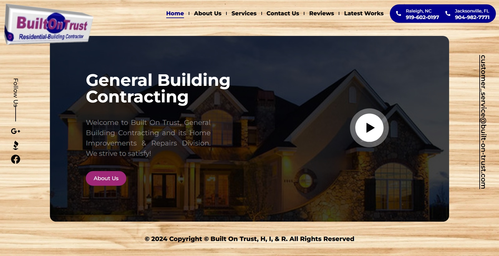
Home Built on Trust 05 03 2026 10 30 PM

May 3, 2026

Built on Trust is a contractor website designed to reflect reliability, craftsmanship, and long-term commitment. The brand message is straightforward — quality work backed by integrity — and the website needed to communicate that immediately.

For this project, I developed a strong, structured layout that highlights services, past projects, and client testimonials without unnecessary design distractions. The visual direction leans into bold headings, clean sections, and confident spacing to mirror the strength and precision of construction work.

Performance, responsiveness, and clarity were key priorities. The final website presents Built on Trust as dependable, professional, and results-driven — exactly what clients look for when hiring a contractor.

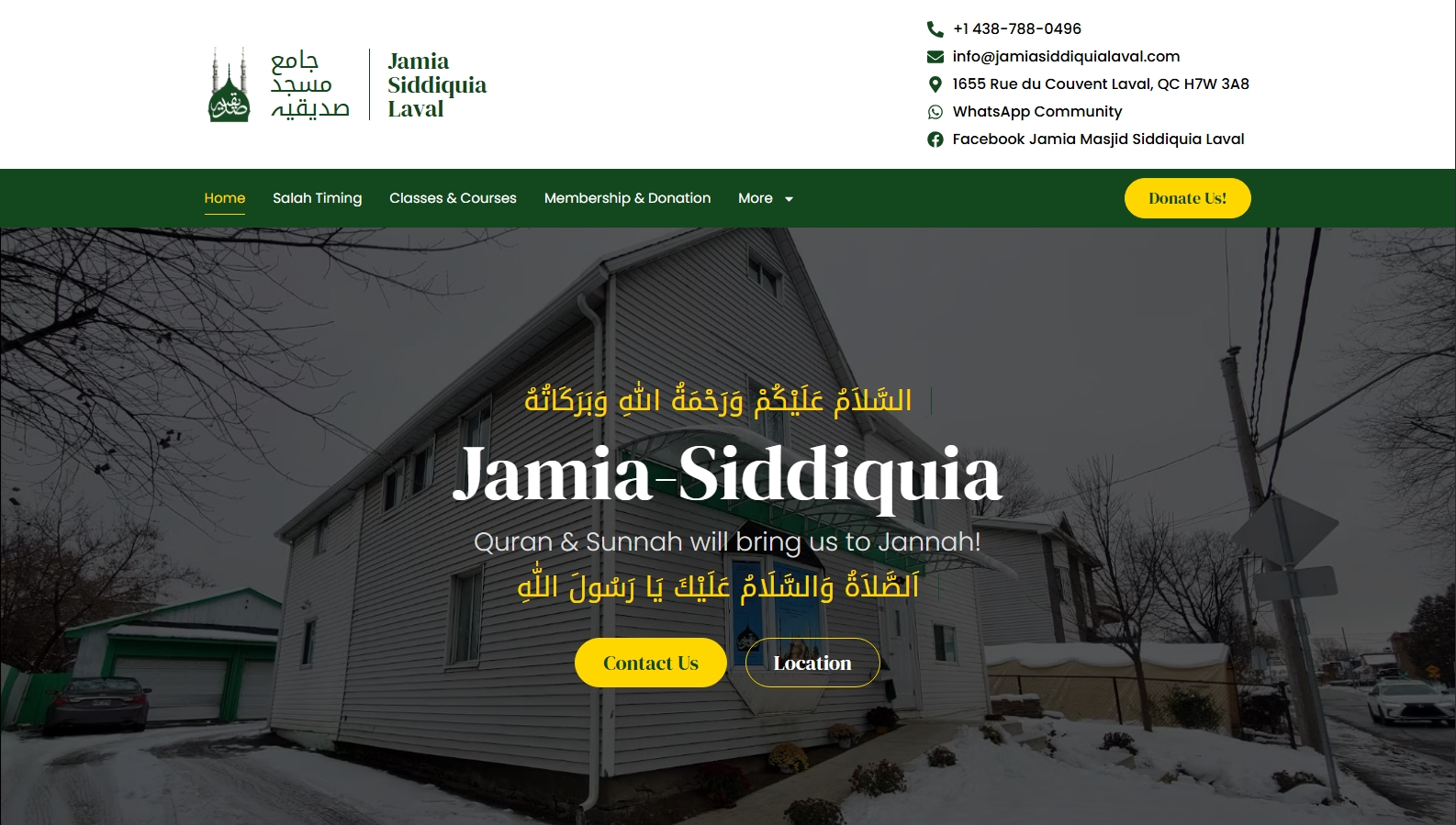
Screenshot 2026 05 03 222509

May 3, 2026

Jamia Siddiquia Laval Masjid required a website that reflects both spiritual identity and community accessibility. The objective was to create a clean, structured, and easy-to-navigate platform where visitors can access prayer times, announcements, programs, and community updates without confusion.

I developed a fully custom website using Elementor Pro, ensuring responsiveness across all devices while maintaining a calm and organized layout. The design approach focused on simplicity, readability, and cultural respect — avoiding unnecessary complexity and prioritizing clarity.

Special care was given to structured content sections, event updates, and mobile usability, as many community members access information through their phones. The final result is a dignified and functional digital presence that serves both the mosque and its wider community effectively.

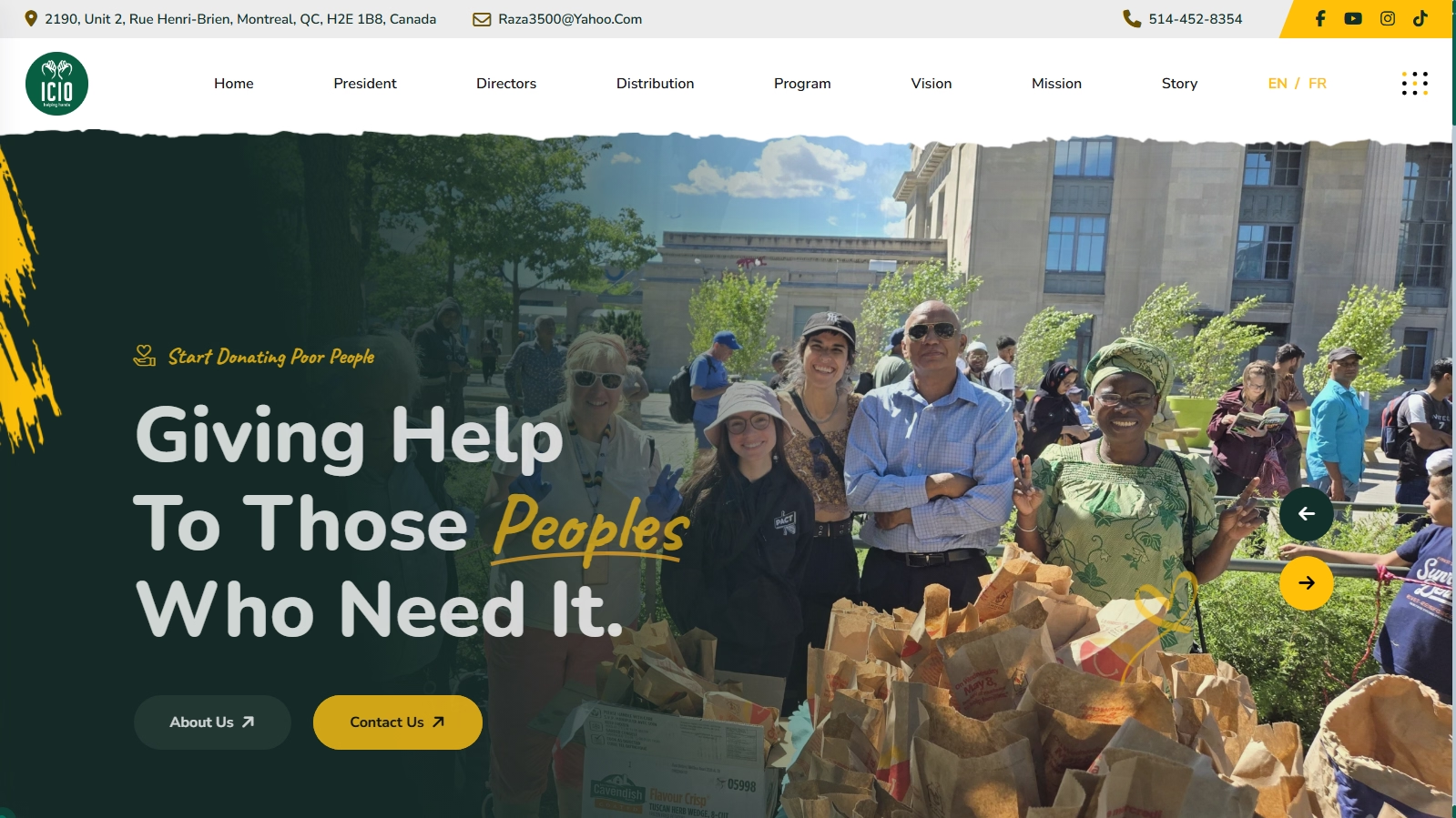
Screenshot 2026 05 03 221841

May 3, 2026

ICIO required a website that communicates trust, transparency, and emotional impact. The goal wasn’t just to build pages — it was to create a digital presence that encourages people to take action.

For this project, I designed and developed a structured, user-friendly NGO website focused on clarity and accessibility. The layout was crafted to guide visitors naturally from awareness to donation, with clear call-to-actions, organized program sections, and easy navigation.

Special attention was given to responsive design, performance optimization, and building a trustworthy visual flow — because in the nonprofit space, credibility is everything. The final website presents ICIO as organized, mission-driven, and transparent in its efforts.

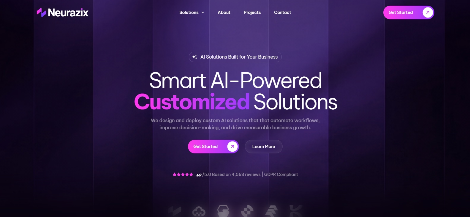
Screenshot 2026 05 03 220858

May 3, 2026

Neurazix was developed from a custom Figma design into a fully functional, responsive WordPress website using Elementor Pro. The objective was to translate the design vision pixel-by-pixel while ensuring performance, responsiveness, and SEO optimization.

I handled the complete front-end development process — converting the Figma layouts into a scalable WordPress structure, implementing responsive breakpoints for all devices, optimizing loading speed, and structuring the site for search engine visibility. Special attention was given to clean layout hierarchy, smooth user experience, and technical SEO fundamentals.

The final result is a modern, high-performance website that maintains design accuracy while delivering strong usability and optimization standards.

Screenshot 2026 02 11 203854

February 11, 2026

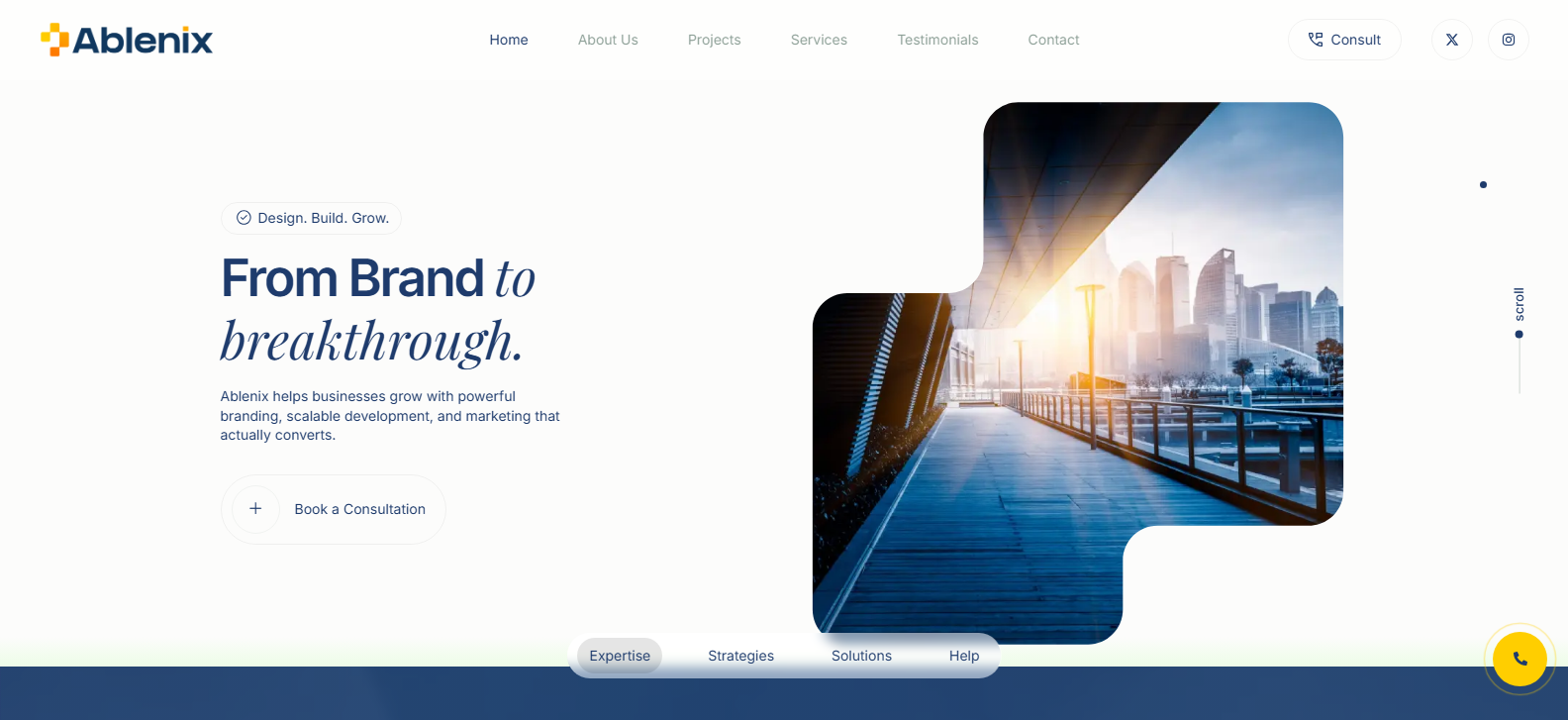
Ablenix helps businesses grow with powerful branding, scalable development, and marketing that actually converts.

house price prediction through machine learning ml cd slide01

February 11, 2026

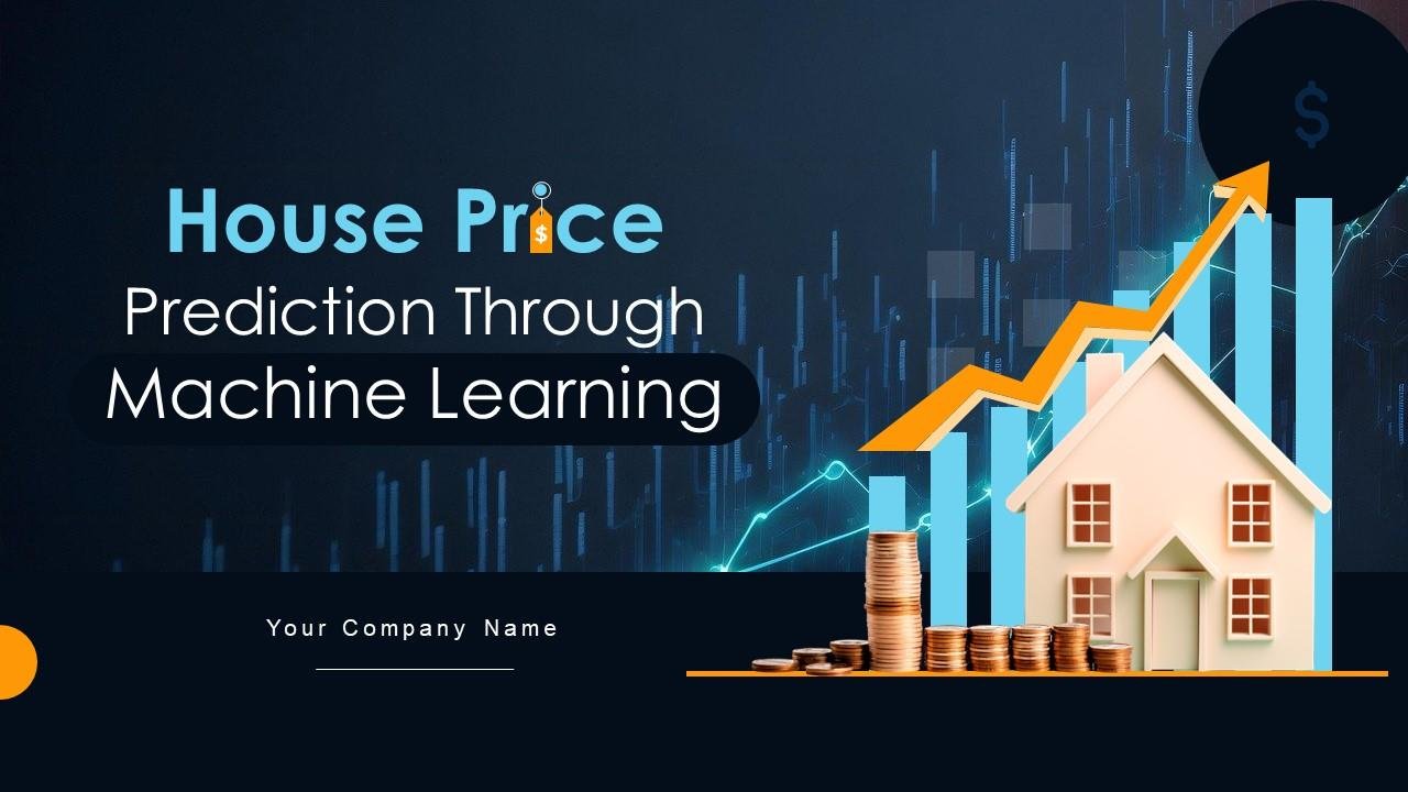
House price prediction uses machine learning to estimate property values based on features like location, size, and number of bedrooms, employing algorithms.